Inspiration
Several photos and works of art inspired this piece. The pose and general style were influenced by Tiffany's famous peacock window.

Another version that offered inspiration:

To create the digital mock-up peacock, I drew more direct inspiration from the following pieces:
1. This old French poster was an excellent example of an adaptable pose and slightly stylized body elements.

2. This lovely photo of a peacock's head was ideal as an example of the patterns of the facial feathers and crown.

3. This highly stylized drawing along with the stained glass pieces, influenced my decision to go for an elaborately abstract look for the peacock. I also really liked how the artist had completely abandoned the realistic colour variations. Although I preferred more of the natural tones for my own piece, it did inspire the use of the standard spectrum cascade.

This is the finished, mounted piece as it exists today:

The process
Step 1: Why I love Photoshop.
As I stated earlier, a digital mock-up was created of the bird using Photoshop and incorporating elements from the many works that inspired this creation. The version that was used as the template for the hand-drawn finished piece was this:

After printing out a full-scale version of the digital mock-up, I was ready for the exhaustive process of transfer, tracing, penciling, inking, painting, embossing, cutting, gluing, etc.
Step 2: transferring and penciling the bird.
I penciled directly over the print-out using a 2B pencil since there is a ridiculous level of detail, and used that to transfer onto a sheet of paper vellum; then I meticulously filled in the detail with a 2H drawing pencil.
 |
| Note that I left out the eyes on the tail. |
In order to add the colour without losing the detail, I had to go back over the entire drawing with micron 005 pens.

Step 5: the verse.
This step had to be next in order to ensure proper placement of the peacock and prepare a surface to receive all of the layers. The poem which accompanies the peacock is an original composition.
Since the bird is such a riot of colours and textures, I wanted to keep the verse much more simple, while not allowing it to be overwhelmed by the opulence of the peacock.
To that end, I chose to mix fonts, using Mutlu for the versals, and killigraphy (both TTF) for the rest. I also wanted to mimic the colour blending I was going to incorporate into the peacock, so I used a dark blue autofeed ink capsule and then created the blend by dipping the nib into black ink at several points during the writing.


Since, in addition to being an artist, I am also an unabashed nerd, I was aiming to replicate a specific fractal pattern called the Fern Fractal and I think it worked pretty well, if I must say so myself.


A very fun and deceptively intricate piece to create! A perfect example of why you should not hesitate in requesting something that may seem odd, fanciful, crazy elaborate or downright impossible. I am always up for a challenge!
Step 4: creating cut-outs.
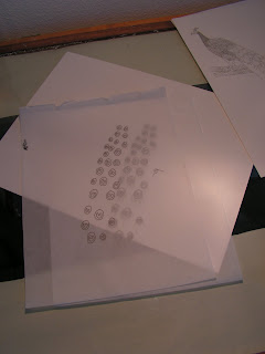
Remember those missing eyes? I wanted to capture a stained glass effect by having those on a separate layer and so they were traced in precise alignment on a sheet of highly translucent tracing paper, to be mounted behind the main bird.


Step 5: the verse.
This step had to be next in order to ensure proper placement of the peacock and prepare a surface to receive all of the layers. The poem which accompanies the peacock is an original composition.
Since the bird is such a riot of colours and textures, I wanted to keep the verse much more simple, while not allowing it to be overwhelmed by the opulence of the peacock.
To that end, I chose to mix fonts, using Mutlu for the versals, and killigraphy (both TTF) for the rest. I also wanted to mimic the colour blending I was going to incorporate into the peacock, so I used a dark blue autofeed ink capsule and then created the blend by dipping the nib into black ink at several points during the writing.
 |
| The peacock in this photo is actually a printed "placeholder" used to avoid inadvertent ink splatters on the final. |
Step 5: Colour.
The peacock was created using Prismacolour (PC) pencils, watercolour (WC) paints and embossing powders (EP). The palette was huge!


Here is the peacock after PCs were filled in:


Next came embossing. Each colour had to be applied, but unset in order to avoid unintentional melt-over. I employed some purposeful melt-over later (accomplished by holding the heat gun over the EPs until they liquidize and then very quickly using both the hot air and a stylus to direct the flow of the colour).


Since, in addition to being an artist, I am also an unabashed nerd, I was aiming to replicate a specific fractal pattern called the Fern Fractal and I think it worked pretty well, if I must say so myself.
 |
| The fern fractal - found everywhere in nature! |
Step 6: Mounting
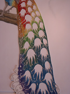
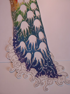
After completing the embossing, I watercoloured the eyes on the tracing paper, then added in the black part with black metallic EPs and a clear EP coating over the watercolour.
I then lined up the peacock with the background/ verse vellum sheet and cut-out the corresponding eyes there. That way, once mounted, light is able to shine through the peacock tail, capturing that stained glass effect I was aiming for.
 |
| slight reflections from the sun on the clear EP. |

 |
| This photo was taken with the light table on and only natural sunlight filtering through the window so as to highlight the effect of the layers. |
 |
| Another shot of the back light tail. |
Once the peacock was mounted onto the verse sheet, I added a radial "highlight" around his head and torso. This was accomplished by going back into Photoshop and using the oval selection tool for placement on my mock-up.
The next step was choosing my "highlight" colour, a deep indigo (hence the qualifications, since it's not your standard highlighting with such a dark colour), and using a radial gradient effect, which I then printed onto another sheet of tracing paper.
After laying it over my hand-drawn bird and penciling in the borders (of the head, neck, torso, and down to the legs to include the full gradient), I cut out the pieces and used a stylus and repositionable glue to apply them to the proper areas. Here is the result:

Wow, that is a huge amount of work- it's beautiful and show's how much pride you take in your art. Well done!
ReplyDeleteSahweet! Nice work Lynnea!
ReplyDeleteWonderful! Researching Peacocks and found this! Wow!
ReplyDelete